How to Design Your Payment Method Selection?
The GoPay payment gateway offers an unlimited number of ways you can display payment method selection during the purchasing process.
This article provides you with basic ways and means of displaying payment methods, which can be useful either when your integration is in progress or when you already use the payment gateway and want to reach a better performance.
1. Decide which payment methods you want to support
Choose from the payment methods you want to support, based on the nature of your business, or which methods your customers prefer.
The GoPay payment gateway supports card payments, online bank transfers, digital wallet payments, coupon payments and Bitcoin payments.
Our tip: The most favorite payments, realized by the GoPay payment gateway, are online card payments and online bank transfers. These methods, together with the cash on delivery option, belong to the top ten payment methods of Czech e-shops.
Besides the payments with GoPay, you can include payments by installments to your order form. You shouldn’t forget to support cash payments, such as cash on delivery.
2. Organize your payment method selection into categories
Presenting the buyer with a bunch of payment methods introduces complexity to the purchasing process. Present your payment method selection according to related categories.
The basic category for organizing your payment method selection is online or offline payment. You can also organize your payments according to the payment method, or the bank which your customer uses.
Below you can find an example of how to organize payment methods provided by GoPay, combined together with the most used offline payment methods.
- cash on delivery (offline)
- online card payment
- online bank transfer (also known as online payment button)
- standard bank order (offline)
- mobile phone payment (online)
- digital wallet payment (online)
- coupon payment (online)
- Bitcoin payment (online)
3. Choose an appropriate option of presenting your payment method selection
Create a selection which presents the payment methods in your order form. To do so successfully, combine the particular payment methods and their categories together.
Your payment methods should be presented in a logical sequence and coordinated according to the related category. We don’t recommend you to organize your selection in the following way: Cash on delivery, PLATBA 24, Card payment, Cash, MojePlatba. The appropriate arrangement would be: Cash on delivery, Cash, Card payment, PLATBA 24, MojePlatba.
Our tip: Put the most used payment methods at the first place in your selection to make them more visible for your customers.
If you support a wide range of payment methods, don’t present them all at once. Only present the most used payment methods in your basic interface and put links of the remaining methods there. Place other details of the payment method to your payment gateway.
You can find the basic options to display payment methods below:
A. Direct option
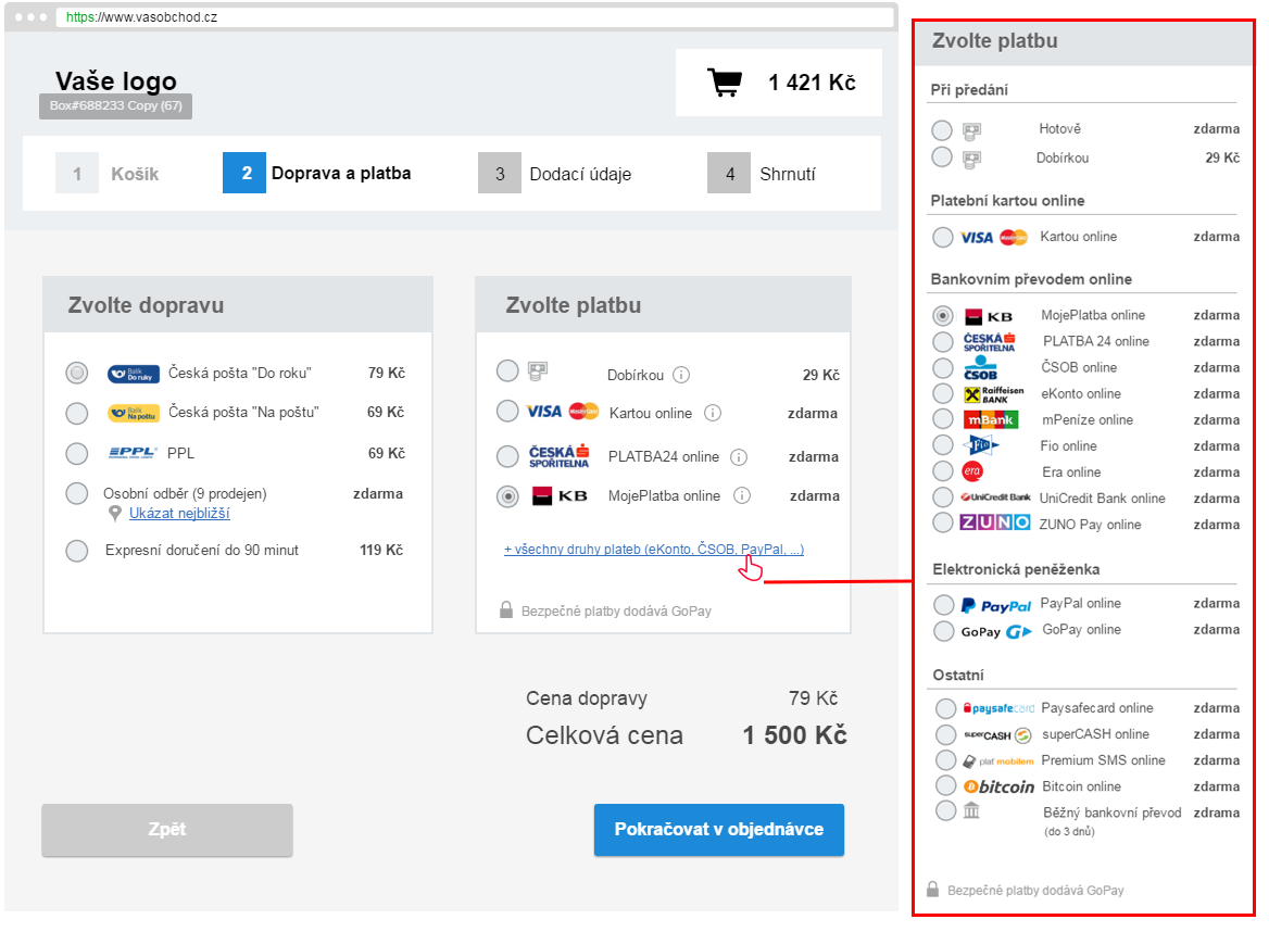 The direct option lets your customer select the payment method directly in the order form. After sending their order, the buyer is redirected either to their internet banking, or to the payment gateway page, which is associated with the selected payment method.
|
Benefits |
Challenges |
|---|---|
|
Full control over displaying of your payment methods
|
Extensive integration process |
|
The particular payment method is selected during the purchasing process
|
Availability of the new payment methods is not guaranteed
|
|
Suitable for using a wide range of payment methods
|
|
|
Used and trusted by the Czech biggest e-shops
|
|
B. Partially aggregated option
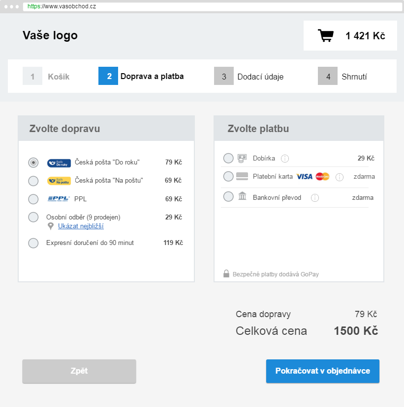
This option lets your customer select the payment method partly in the order form, and partly at the payment gateway, to which they are redirected after finishing the order. For instance, the buyer can select the bank transfer and finish the payment at the payment gateway - by choosing the particular bank institution and sending money to their account.
| Benefits | Challenges |
|---|---|
| Easy integration process | Redirecting to the payment gateway to choose the bank is necessary |
| Availability of the new payment methods is guaranteed | |
| Suitable for all businesses |
C. Aggregated option
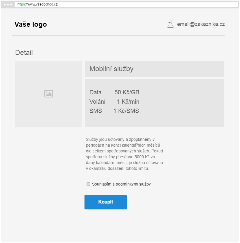
After your customer finishes the order, they select the payment method at the payment gateway. There’s only one button displayed in the order form.
|
Benefits |
Challenges |
|---|---|
|
Easy integration process |
Unsuitable for a wide range of payment methods |
|
The particular payment method is selected at the payment gateway |
|
|
Availability of the new payment methods is guaranteed |
|
|
Suitable for businesses focused on service supply |
|
4. Keep it user-friendly
There are a number of principles to follow when designing the payment method selection. If you really want to make the payment method selection absolutely clear for your customers you must do more than just place the methods in close proximity and link them with the associated payment. What really matters, when facilitating the purchasing process, are specific details such as providing with a description of a particular payment method, or using logos and tooltips.
Below can be find basic tips on how to work out those details.
-
Add an active link to the payment method selection row
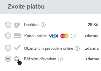
Make the payment method selection process seem intuitive, so the customer can choose from the payment methods effortlessly. If possible, facilitate the purchasing process for your customer as much as you can. Adding an active link to the particular payment method selection row might helps. This enables your customer to click on the selected row without having to click on the checkbox, or radio button, to confirm their payment method.
Example of what an active link for choosing the payment method looks like
-
Organize details of the payment method selection clearly
The way you organize the section with further details related to the particular payment method has a great influence on the clarity. You should avoid using an exaggerated visual style, when organizing the details.
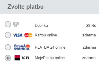
Our tip: The logos of payment methods enables you to achieve a better presentation of payment methods in the order form. Place the logos right next to the radio button or checkbox, therefore your customer can see the offered payment methods easily when skimming through the page.
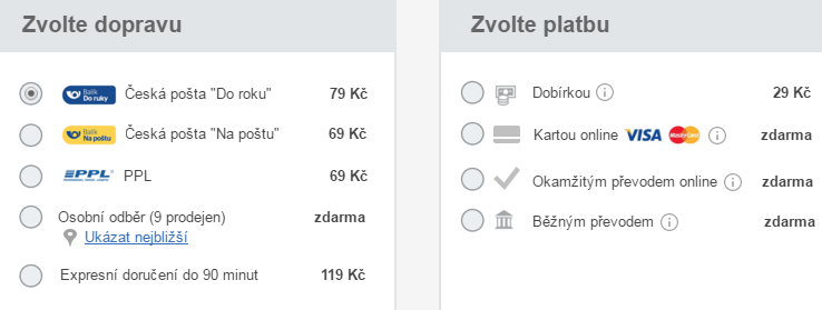
Place the checkbox, or radio button, at the first place of the row (which is on the very left). The name of the particular payment method should follow, accompanied by a tooltip and price. The price should be placed at the right side and justified, so the customer is able to compare it.
Example of what a radio button>logo>name of the payment method>price arrangement looks like
-
Link the particular payment method with shipping/delivery
If you offer specific kinds of shipping which are only supported by a few of the payment methods, present such combinations in the order form. For instance, the express shipping option doesn’t support the cash on delivery and standard bank transfer option, therefore you shouldn’t provide a combination of these choices.
You can fix this problem by adding a lighter shade to the text, which reffers to the particular kinds of shipping not supported by specific payment methods.
Example of how you can present particular payment methods with related kinds of shipping
